Client
Hotel Thaynes
Services
Brand Strategy
Identity Design
Positioning
UI/UX Design
Copywriting
Media Development
Identity Design
Positioning
UI/UX Design
Copywriting
Media Development
Awards
Best of Show, Integrated Brand Identity, Addy Awards AAF Midwest
The Mission
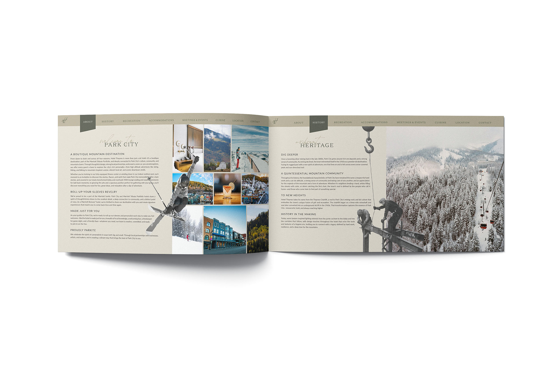
This Park City establishment, long cherished by the community, has recently come under new management. As part of their revitalization of the property, the owners sought a complete re-brand to celebrate their new direction, as well as their new name: Hotel Thaynes.
The client wanted the new brand identity to reflect the historic nature of the humble town. Park City was originally known for its mining boom, including ore, including gold, silver, lead, zinc, and copper. The industry began in the 1860s and continued until the 1980s, shaping the town's economy and attracting a diverse workforce.
Now a popular destination for skiers, snowboarders, and even the Olympic Winter Games, people from across the globe visit to challenge its 7300 acres of ski-able terrain.
The Outcome
In the end, the brand we helped come to fruition was one that paired historical moments in time with new modern visual elements—a complementary combination that is both eye-catching and a tribute to the foundation of Park City.
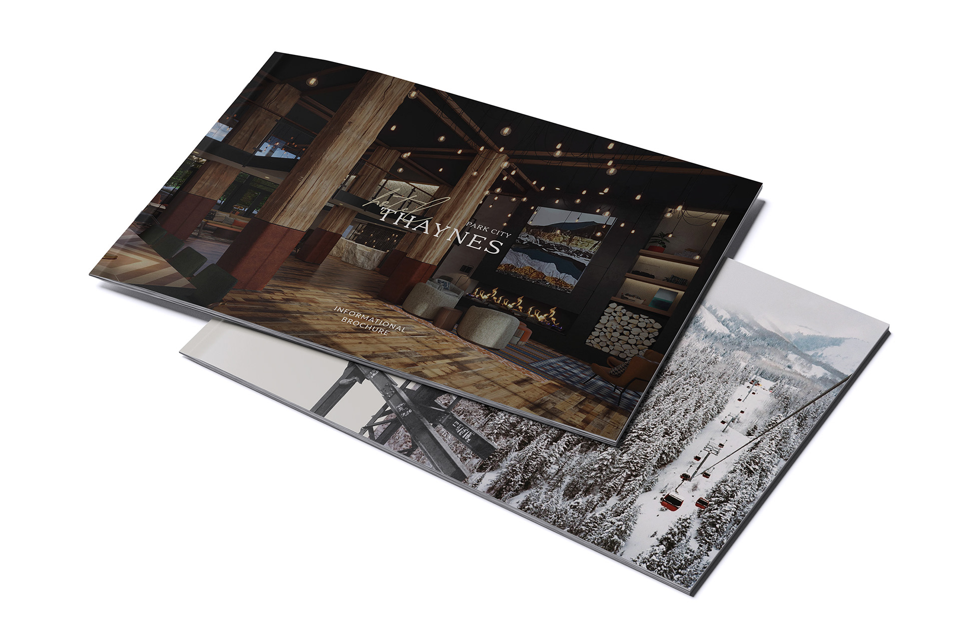
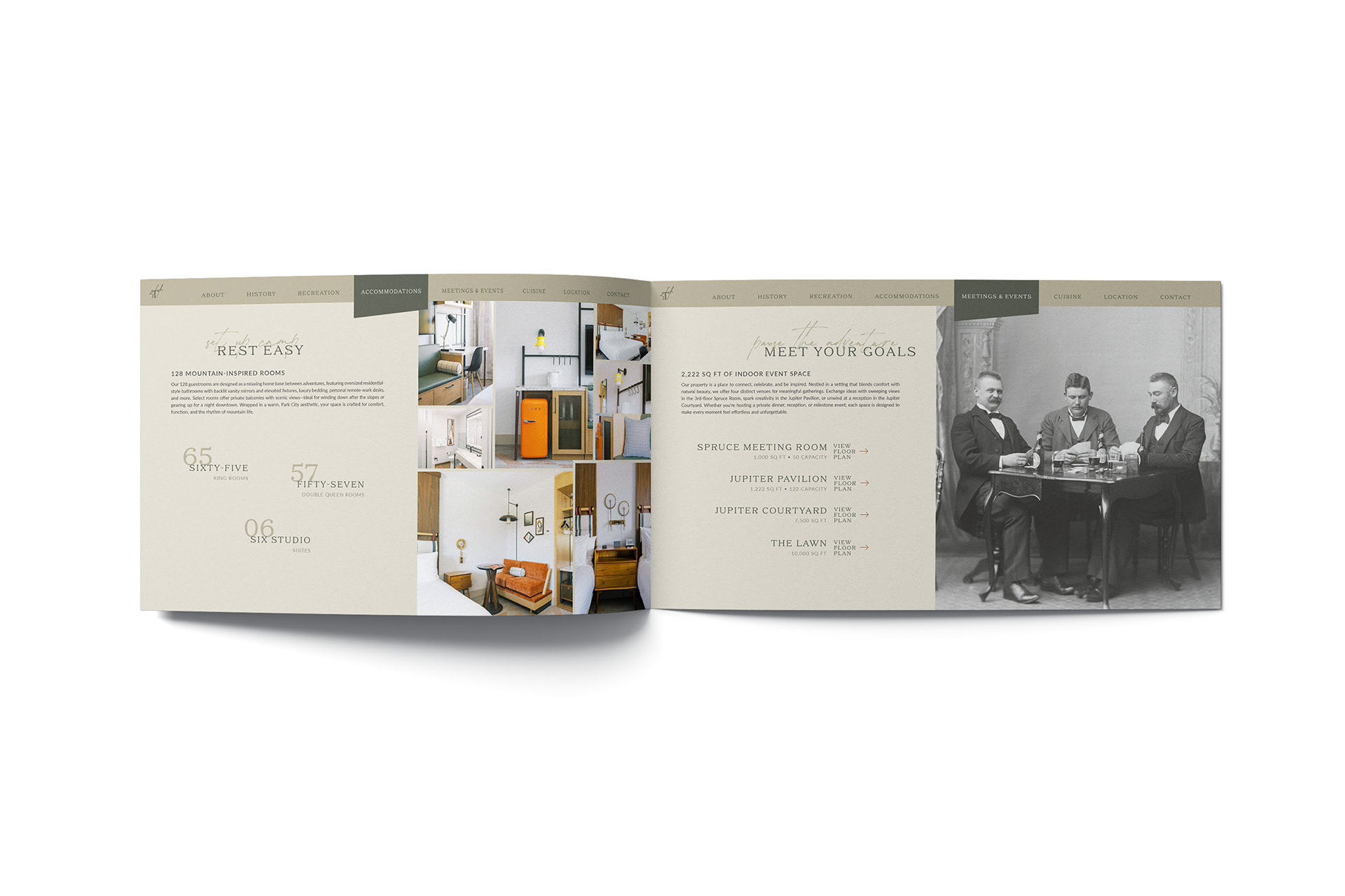
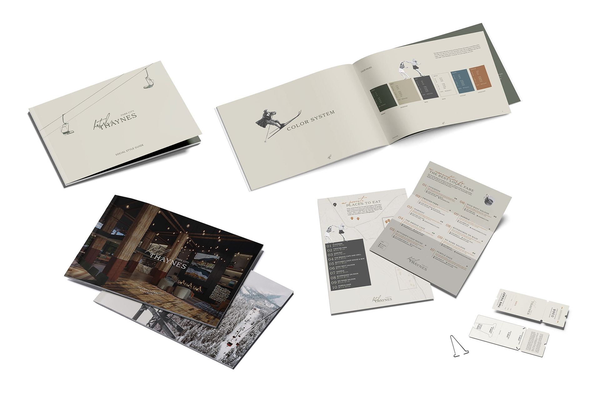
We developed an informational brochure that highlighted all of the upcoming amenities and features of the resort. A major component of the renovation included a multi-million-dollar expansion of the property; this booklet served as a helpful guide to promote the new services being offered to its guests.
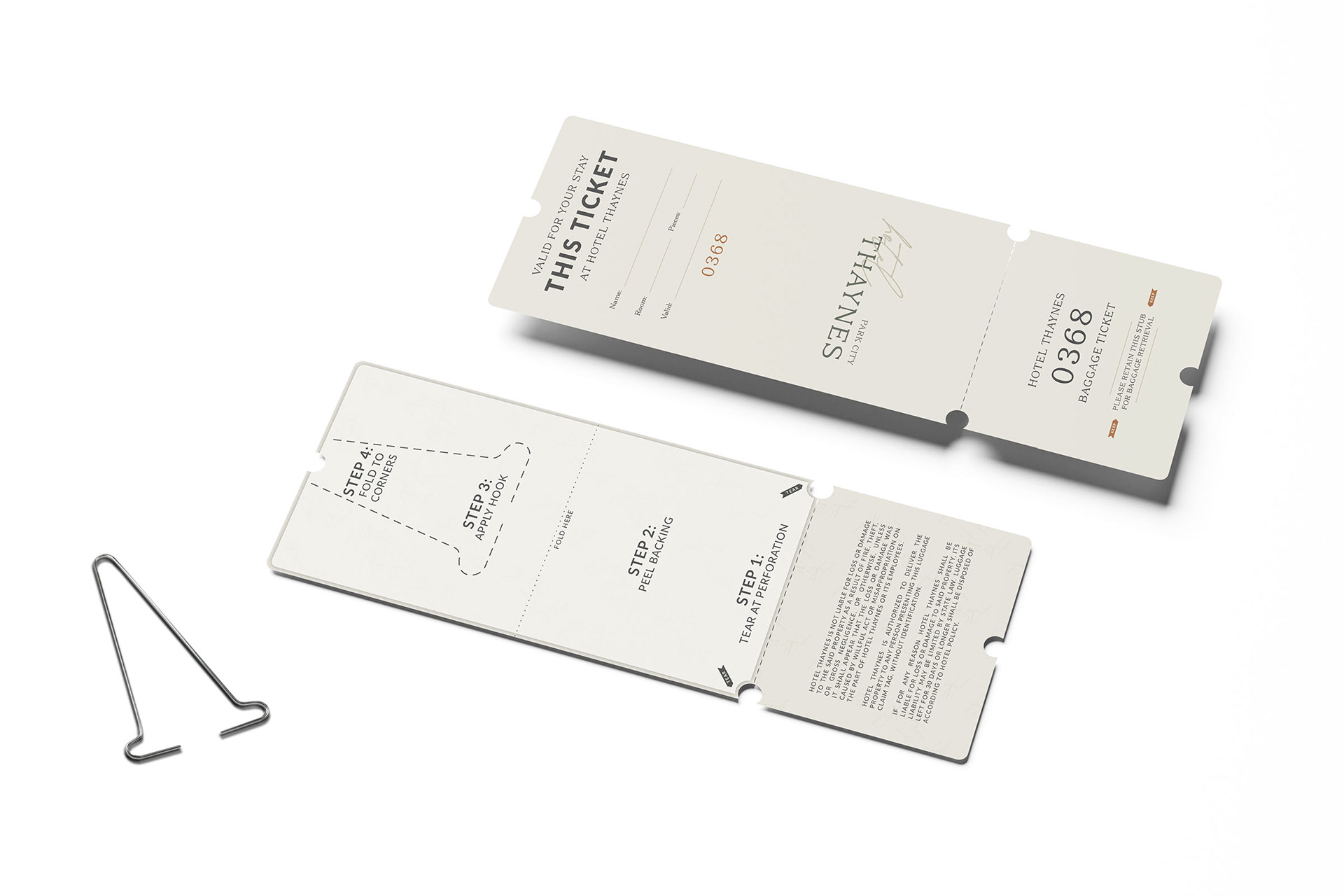
Influenced by the skiing destination, we elected to make their guest luggage tags akin to classic ski lift tickets. This subtle touch re-imagines the humble tag in a meaningful and memorable way.
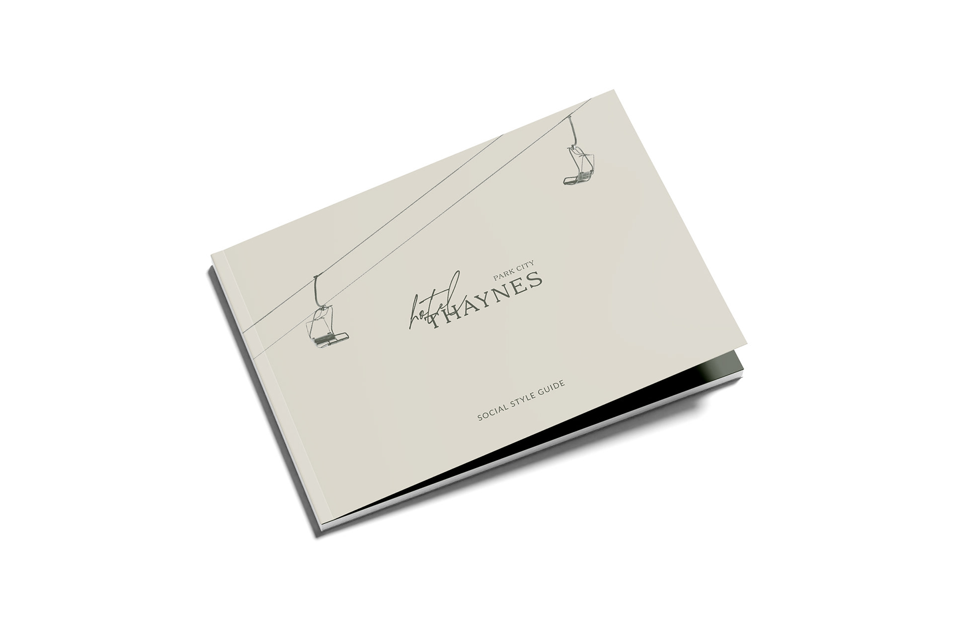
With a brand as large as this one, it was important that we captured the heart, soul, and breadth of the new identity in a series of helpful guide books, such as this social style guide. By providing the hotel's staff, management, and business partners with these supportive assets, we helped ensure that their brand stays consistent, cohesive, and unforgettable for years to come.
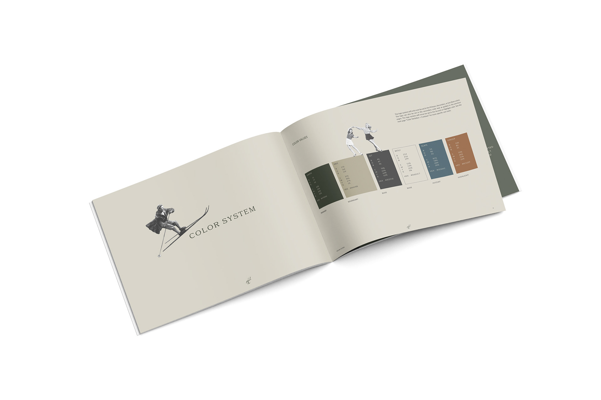
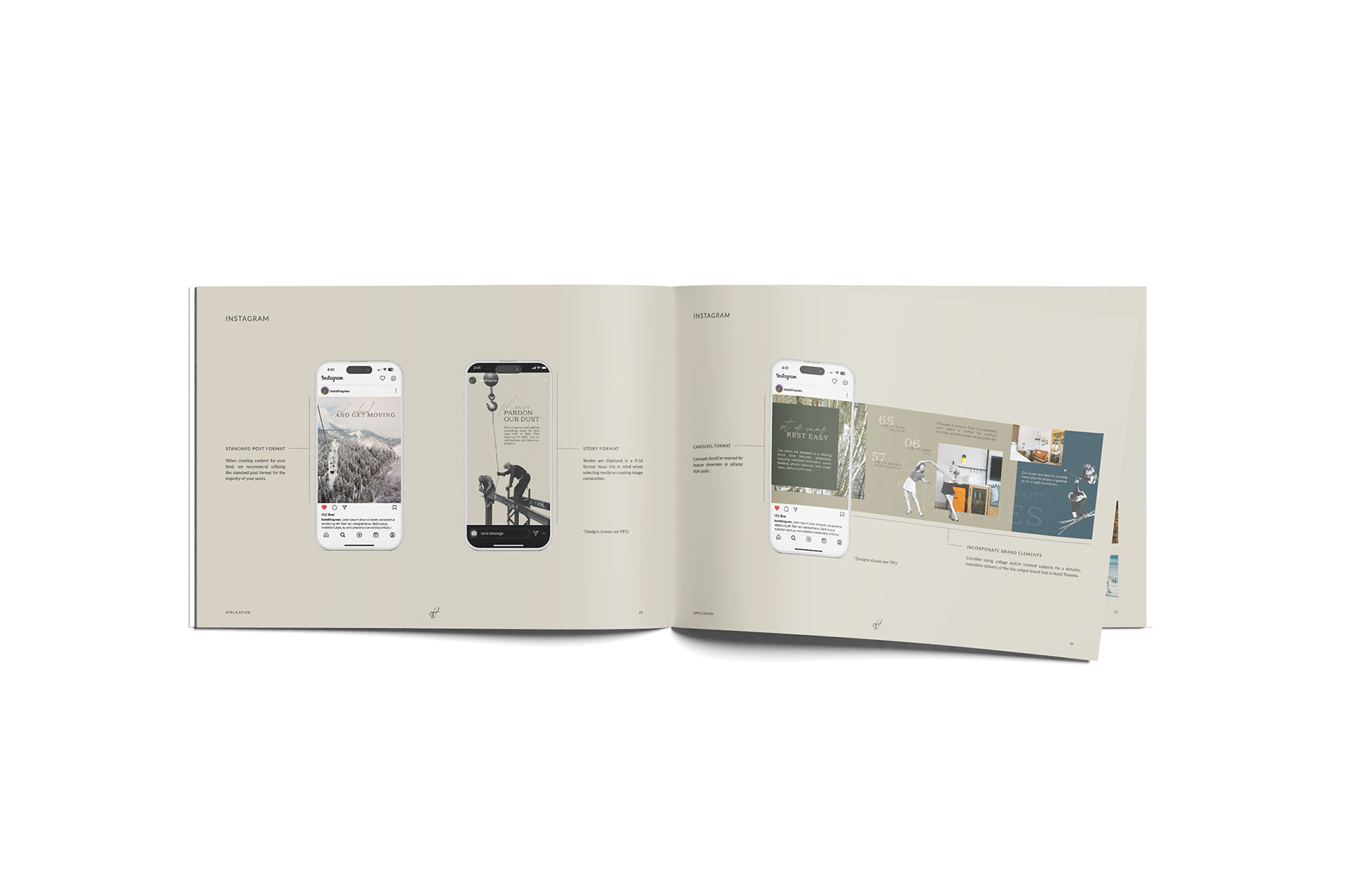
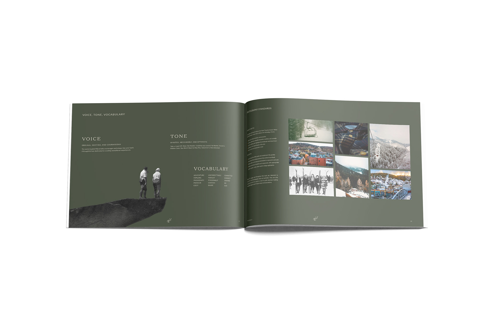
Everything from fonts, colors, typefaces, photography, and more were captured in these guide books, helping inform their team on the new brand in a visually pleasing manner.
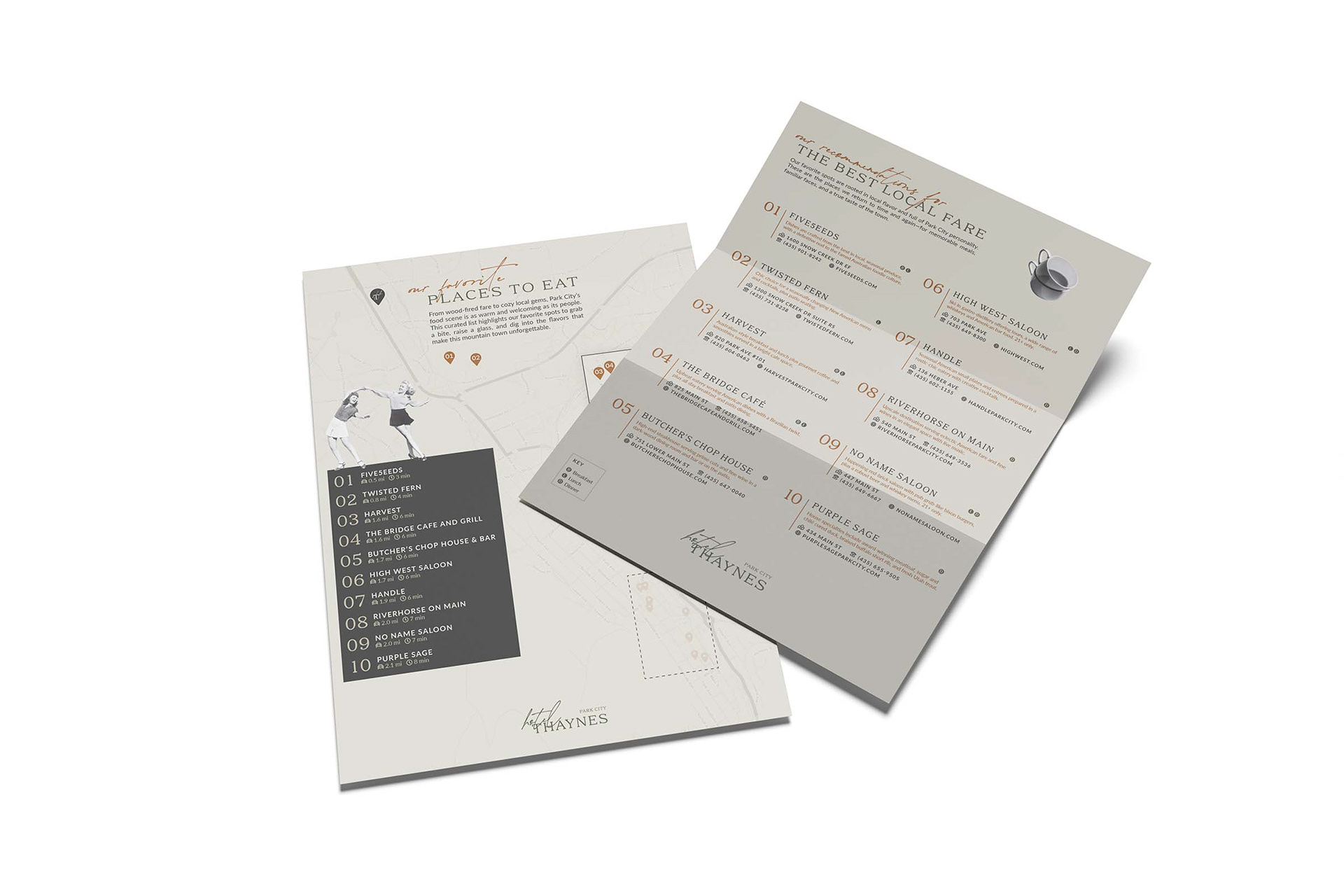
Other pieces of collateral included several catered specifically for their patrons. Custom key cards, in-room stationary, retail items, and informative brochures (like this Top 10 Restaurants Guide for Park City) are just a few of the materials developed to make this hotel a memorable vacation spot for its guests.